Final Draft:
By 1938, the
Great Depression had been going strong for almost a decade and although some improvements had been made, the second recession in 1937 had set back most of th

e progress made. After the
second recession, unemployment had risen again to 19% and industrial production had fallen 25%. Economic recovery was slow and significant improvements were still required for a return to normalcy. In fact, it would take the United States’ sudden involvement in World War II to finally break its economic slump (Smiley). Taken in November of 1938, still before the recovery from the second recession, John Vachon’s
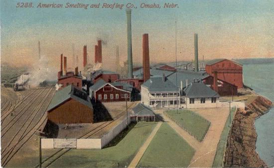
photograph American Smelting and Refining Company: largest iron smelter in the world uses the industrial decay of the Great Depression to develop the rundown pathos of the poorly maintained environment, symbolically mirroring the general attitude of the American people from the time of its taking, through the technical elements of framing and cropping and coloration.

The framing of the photograph
American Smelting and Refining Company: largest iron smelter in the world naturally creates hierarchy in its elements. The first area the eye is drawn to upon looking at the photograph is the foreground, which consists of the scrap yard and adjacent buildings. Being the closest and thus easiest to see, this gives the scrap yard an emphasis over the rest of the factory’s grounds. Furthermore, the height of the shot, possibly taken from atop a nearby building, looks into the yard and shows the factory behind but isn’t high enough to give a clear shot of the latter. This gives additional emphasis to the yard, its view being unobstructed unlike those further back. Given its prominence in the photograph’s hierarchy we take the yard and its contents to be more important than the other things in the image. Examining the yard shows that it is filled with what appears to be scrap (old metal to be re-smelted and recycled) although the piles could include trash of other sorts as well. Given the large drop in industrial production during the Great Depression, still continuing to the taking of this picture, it’s a reasonable conclusion that this scrap wasn’t being used simply because of low demand. Also given the cultural context and associations of sitting
scrap metal with poorer areas (i.e. in the poor part of town or in enervated rural regions), it speaks to the general condition of the Great Depression whilst also carrying with it the pathos of the audience’s experiences (or lack thereof) with such areas. Specifically, by generating the sense of economic dilapidation and decay, the photograph develops a feeling of a lack of progress, opportunities, and even to an extent, hope.
The surrounding buildings, and indeed the rest of the yard itself, continue the dirty, worn down appearance of the scrap. The buildings, likely meant for storage instead of work, seem even broken in parts but certainly unclean and not of expensive make. This setting strengthens and reaffirms the aforementioned impact of the scrap located within. It is only in the background that the cleaner factory, and its many smoke stacks, can be seen, carrying its connotations of technology, production, and modernism. Analogously, the Great Depression gave emphasis (especially in a historical context) to the decline in production, unemployment, and economic stagnation that came with and after the initial recession, placing it in front of any continuing activity and production.
Another consideration derived from the framing and cropping of the photograph is the noted lack of any people, even any plants. First, this gives further emphasis to the other subjects of the photo, reducing the number of elements hence making it easier to distinguish the intended focus(es). By not having people included in the image, it clears the image of further clutter and takes them away as possible targets of discussion (despite the fact that their lack has sparked this note). Secondly the lack of people, and more specifically people working, further illustrates the impact that the Great Depression has had on industrial production; it certainly wouldn’t have served this argument’s purposes to show a yard crowded with men at work. The removal of the organic also serves to continue not only the industrial motif but the rundown pathos developed by the image, removing empathy and increasing the sense of desolation.
The cropping plays a role in its own right as well. Being a single photograph of this subject, the issue of cropping comes down to the question of what lies beyond the edges of the photograph and why were things included or not. First, the edges of the yard are cut off by the edges of the photograph. This denotes a lesser importance or emphasis on those things not included completely in the picture, in this case focusing on the center of the yard instead of the buildings the run off the edge, including both those in the foreground and the factory in the background. Secondly, the cropping does not include many of the boundaries of the factory grounds, only a small portion of the fence visible at the bottom of the picture. This lets the audience ex

trapolate the content of the image beyond its physical edges. In this picture, cropping lets us imagine the scrap yard expanding beyond those boundaries, likely surrounded then by additional industrial areas and buildings not of the
American Smelting and Refining Company proper. This continuation strengthens the photograph’s argument as one that is much more universal than a particular instance, that it is a general situation instead of specific condition.
The coloration also plays a role in the development of the photograph’s arguments, or as should be said, the lack of coloration. Being a black and white photograph, it only contains the achromatic spectrum. The colors of an image contribute to the pathos therein, drawing on what the audience has learned to associate with them. This photograph is primarily made up of grays, only including small spots of strict white or black. The grayness again continues the industrial motif, mirroring th

e impact that the exclusion of anything organic has. This is emphasized further by the fading (likely just from the camera or developing of the photograph) and the visible, white smoke which create a sense of
haze and less than clean air quality, tying again into the audience’s associations with industry. Secondly, the colors create a tired, dreary, or even gloomy pathos that ties into the aforementioned rundown pathos. By lacking any vibrant hues or even stark contrast, the coloration makes the picture seem emotionless (unlike this colored illustration of the factory). The black and white nature of the photograph also, especially for contemporary audiences, clearly reminds viewers of its historic context. To an extent, this decreases the audience’s (again, especially contemporary and younger audiences) ability to relate with the photograph, although the current recession makes such relations more apt to happen.

Knowing the context of the photograph, these combined technical elements serve as logos to the symbolic comparison of the nation’s general attitude of the time. After almost a decade of the Great Depression and shortly after a second recession, America’s economic prospects, and thus the American people’s prospect, did not lean towards the hopeful. With so many
unemployed and more who lost their savings, the Great Depression didn’t breed optimism. The lack of opportunities and progress, in fact facing regression, the national outlook for life and the times to come was not good. The photograph works to mirror this state of mind by developing a similar pathos. By focusing on the dilapidation of the scrap yard and extrapolating it beyond the photograph’s edges, it emphasizes the time’s economic conditions. This coupled with the removal of the organic and the dominating use grays serves to portray the aforementioned outlook even further. Through this pathos, developed by the technical elements of framing and cropping and coloration, the John Vachon’s photograph
American Smelting and Refining Company: largest iron smelter in the world illustrates and reminds its audience of this attitude.
Broad, Mark. "I remember the Wall Street Crash." BBC News. BBC News, 6 Oct. 2008. Web. 17 Feb. 2010. (
Site)
Smiley, Gene. "Great Depression." Library of Economics and Liberty. Library of Economics and Liberty, n.d. Web. 17 Feb. 2010 (
Site)