Tuesday, April 27, 2010

WP3: Final Draft

Authors Note:

Although taking (rather given) option 2 to write a letter instead of writing a traditional essay analyzing the rhetorical elements of the sculpture, I still maintained a degree of analysis as my approach to the letter, discussing the argument and its support with the sculpture. The form is obviously different, given a different tone to fit a letter over a formal paper. A notable change is in that of grammar and structure, intentionally created small mistakes to make it read more poetic or artful than a straight description.

In terms of analyzing Superstructure on 4, it was much closer to the analysis of the photograph than of the comic relating to the arguments formation. Rather than starting with a fairly clear argument I relied on the elements to lead the arguments discovery which was yet revealed as its current state only upon the initial drafts of writing, a naturally fitting conclusion.

I had originally chosen this sculpture partly because it "spoke to me", but mostly because my (Arch) perceptual drawing class had just started a positive-negative drawing for which I was in search of a subject, the forms of Superstructure on 4 working nicely for it. Indeed the subject matter worked out making two successful pos-neg drawings. Choosing the sculpture to write a letter to also panned out, not requiring/presenting significant resistance, although it did take a long contemplation. My positive-negative analysis also revealed a couple things more clearly as noted in the letter.

The main changes made from first draft to final were a couple spots expanding on my concepts, such as the organic assembly arising from the geometric components. I didn't take any major changes of direction, especially because with only one review there was less time for change as it was.


Dear Superstructure on 4,

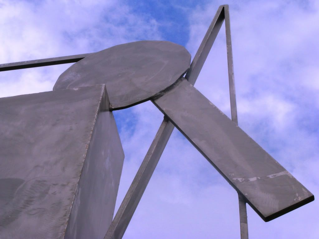
You are full of coherent conflictions, dichotomies several as you sit outside here among brothers and sisters. Although you appear simple at glance, you play as sculpture upon investigation, revealing new levels of thought, and I would discuss such.

First and most present is the burnishing of your surfaces. Although all of your structure is constructed geometrically, your stainless steel faces show the reflecting brushes of a free hand, nigh upon chaos. Your form upon glance is that of geometric, industrial, constructed origin. Your straight lines, right angles, even your ellipses and hexadecagon, your stainless steel materiality, your cleanly welded connections and planar restrictions suggest not a free amalgamation but strictly logical assembly, thought-out fabrication.
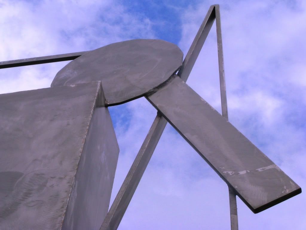
The surface patterns instead at once dematerialize your surfaces, conflicting your form simple, but fit so naturally, not seeming out of place. Certainly, in the suns of bright day the burnishing begins to override your physical voluminous shape. Beyond the play of shapes together, the brush makes each surface its own possible focus point drawing the eye for only its own contemplation. With far cry from geometric industrial construction, what do you tell us with this apparent conflict of themes?

Next comes from your still geometric assemblage, the totemic presence that many of Smith's other works carried. Your shape in this regard has been described as planar appendages jutting from a boxy torso upon four stilt-like legs. And although other may attribute this organic flow to other, but still organic, forms, your precedence and my freedom of analysis yet shows man in your form. As seen and noted, your form simple is constructed of geometry, each piece a panel of straight depth and each panel simple shape. The most free-form of your components is yet a foci-bound ellipse.

Although irrefutably reduced and abstracted to near non-objectivism your stance portrays still of the organic. I believe it comes from the organic assembly, more rather the angular progression of those planar appendages, flowing in an arc over your tilted head, showing not many arms but a movement or form of just two. Your geometric construction betrays again its origin to display free-form expression, leaving the nature of its simple abstracted components to create life.
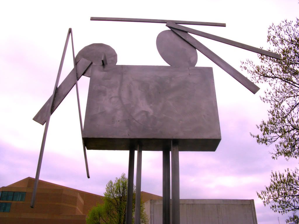
Even your name gives duality to your existence. Superstructure on 4. Where Superstructure with 4 or even Superstructure 4 would combine your stance as one, your title makes us break your shape in two. Cut at the top of your stilt-like legs, the superstructure lies on top, based by your boxy torso with planar appendages attached, resting on top of the separated 4 that serve as a stand for the rest to sit upon. No longer can you be looked at as one geometrically flowing stance but now as one form resting upon an equally abstracted pedestal.

Indeed this separation emphasizes this third dichotomy in your being. Although only forming a third of your height, your superstructure, your extraordinary construction, contains two thirds of your elements and exponentially more interplaying complexity. The two-thirds tall legs are in fact pressed to such simplicity as to further repeat this difference. First and especially noted in my positive-negative analysis of your form, your legs seem much too straight and narrow to be true to your physical form. I checked several times of my measurements and my drawing before I could convince myself that the proportions were true to your life. Thankfully for form and possibly stability, your legs are tied by this ellipse. Not only does this single piece tie and attach your legs together, but it serves as a much needed break from the straight and narrow of your stilt-like legs. Even when it seems out of place in first glance, as if fallen from the superstructure above, this piece as the rest seems all so natural when placed in a negative-positive eye.

So what do your dichotomies explain, do your conflictions portray, your differences exclaim? I know not specifically and I think not that it should be limited specifically in argument. Instead it talks to the simple appearance, existence, possibility of such apparent contradictions. Instead of contradicting they act more as colors, the opposites not being repulsive together but in fact, and they are called such, complementary. For just as complementary colors serve well together and are used as a simple implementations of color to create interest and cohesion, not confusion and disparity, your opposing combinations combine smoothly so to create that which is greater than the sum of its parts. But what for these oppositions exist? What you ask of art, of me, of us, is to look for such plays of conflict and hidden dichotomies as we travel the day, to seek revel and understanding in these acknowledgements, and to leave our own distinctive complements as well.

Wednesday, April 21, 2010

WP3: First Draft

Dear Superstructure on 4,

You are full of coherent conflictions, dichotomies several as you sit outside here among brothers and sisters. Although you appear simple at glance, you play as sculpture upon investigation, revealing new levels of thought. I would discuss such.

First and most present is the burnishing of your surfaces. Although all of your structure is constructed geometrically, your stainless steel faces show the reflecting brushes of a free hand, nigh upon chaos. Your form upon glance is that of geometric, industrial, constructed origin. Your straight lines, right angles, even your ellipses and hexadecagon, your stainless steel materiality, your cleanly welded connections and planar restrictions suggest not a free amalgamation but strictly logical assembly, thought-out fabrication.

The surface patterns instead at once dematerialize your surfaces, conflicting your form simple, but fit so naturally, not seeming out of place. Certainly, in the suns of bright day the burnishing begins to override your physical voluminous shape. Beyond the play of shapes together, the brushed makes each surface its own possible focus point drawing the eye for only its own contemplation. With far cry from geometric industrial construction, what do you tell us with this apparent conflict of themes?

Next comes from your still geometric assemblage the totemic presence that many of Smith's other works carried. Your shape in this regard has been described as planar appendages jutting from a boxy torso upon four stilt-like legs. And although other may attribute this organic flow to other, but still organic, forms, your precedence and may freedom of analysis yet shows man in your form. Although irrefutably reduced and abstracted to near non-objectivism your stance portrays still of the organic. I believe it comes from the angular progression of those planar appendages, flowing in an arc over your tilted head, showing not many arms but a movement or form of just two. Your geometric construction betrays again its origin to display free-form expression.
Even your name gives duality to your existence. Superstructure on 4. Where Superstructure with 4 or even Superstructure 4 would combine your stand as one, your title makes us break your shape to two. Cut at the top of your stilt-like legs, the superstructure lies on top, based by the boxy torso with planar appendages attached, resting on top of the separated 4 that serve as a stand for the rest to sit upon. No longer can you be looked at as one geometrically flowing stance but now as one form resting upon an equally abstracted pedestal.

Indeed this separation emphasizes your this third dichotomy in your being. Although only forming a third of your height, your superstructure, your extraordinary construction, contains two thirds of your elements and exponentially more interplaying complexity. The two-thirds tall legs are in face pressed to such simplicity as to further repeat this difference. First and especially noted in my positive-negative analysis of your form, your legs seem much too straight and narrow to be true to your physical form. I checked several times of my measurements and my drawing before I could convince myself that the proportions were true to your life. Thankfully for form and possibly stability, your legs a tied by this ellipse. Not only does this single piece tie and attach your legs together, but is serves as a much needed break from the straight and narrow of your stilt-like legs. Even when it seems out of place in first glance, as if fallen from the superstructure above, this piece as the rest seems all so natural when placed in a negative-positive eye.

So what do these dichotomies explain, do these conflictions portray, these differences exclaim? I know not specifically and I think not should it be limited specifically in argument. Instead it talks to the simple appearance, existence, possibility of such apparent contradictions. Instead of contradicting they act more as colors, the opposites not being repulsive together but in fact, and they are called such, complementary (colors) they serve well together and are used as one of the most simple implementations of colors to create interest and cohesion, not confusion and disparity. What Superstructure on 4 asks of art, of me, of us, is to look for such plays of conflict and hidden dichotomies as we travel the day, to seek revel and understanding in these acknowledgements, and to leave our own distinctive complements as well.
Tuesday, April 20, 2010

WP3: Statement of Purpose

My meta-purpose of writing this letter is to earn a good grade in my class and learn in the process. My purposes within writing the letter will be to include "descriptive observations about the sculpture, reflections, meditations, and insights that the aforementioned observations stimulate, and filter both the observations and reflections through a specific aesthetic-conceptual paradigm." This letter is to be read aloud for its final presentation.

My primary audience for this presentation will be the sculpture Superstructure on 4, to whom the letter will be addressed. Inanimate objects are not typical audiences to communication. In this case, Superstructure on 4 will serve as a port to communicate to art in the complete sense including past and future processes and implementations of particular techniques and concepts.
My first secondary audience will be my professor for whom I will be writing and presenting this letter for the goal of receiving a good grade in my class which has prescribed it writing. For this audience I will try to implement discussions of the techniques and themes that have been talked about in general and in specific regards to my chosen sculpture.

My next secondary audience will be my class who will all witness my verbal presentation of my letter to my sculpture. One of them in particular will read my a draft of my letter in a digital context as a peer-review. For this audience I will try not to be unintentionally embarrassing.

My final secondary audience contains all who may happen upon my letter or its presentation. Like the past two writing projects, this one will remain online, posted on my public blog for any and all to read. The verbal presentation also creates for a small group a much higher probability to its exposure whether just noticing or, less likely, actively paying attention although in regards to my presentation this will still be a random selection. For this audience I will try to make my letter and presentation more universally relatable (this will be even easier than the last two projects which had a heavier reliance on a particular wording).

The primary context of my letter will be its final presentation, being read aloud by myself outdoors in front of my selected sculpture outside the Sheldon. For this I will practice at least a little reading my letter aloud making sure everything sounds right when verbalized and further familiarizing myself with its content for more fluid presentation. My letter will have a secondary context of being posted on my blog where it can be viewed by anyone. For this context, additional hyperlinks and multimedia elements will be included that would be superfluous in the verbal presentation.

Sunday, April 18, 2010

WP3: Prewrite 4

Superstructure on 4 was created by David Smith (1906-1965) in 1960. Working as a welder and a riveter gave him the metal working experience that would play an important role in his future of welded sculpture that he would pioneer in the United States. After starting his constructions in the early 1930's, Smith took a break during the second world war to work in a defense plant welding tanks and locomotives.

Smith received a background cubism, surrealism, and constructivism from several influential teachers, combining elements of biomorphic figuration and geometric abstraction. Although he defied the traditions of vertical, monolithic sculpture following World War II, working in open-ended horizontal formats, his work had returned to the vertical by the creation of Superstructure on 4. We worked on several sculptural series in the 1950's including works that incorporated scavenged metal parts from old farm machinery and other metal components. In the latter part of the 50's he worked on the series "Setinels", many of which were strongly anthropomorphic and resembled primitive totems recreated in industrial materials.
Superstructure on 4 also follows this, suggesting a totemic personage with its boxy torso and planar appendages sitting atop its 4 stilt-like legs. It is partially a transitional piece as it also contain elements of his later more geometric series "Cubis". Superstructure on 4 was meant to be situated outside; Smith placed it out in his sculpture field to contemplate it through the year. Part of this intentionality comes from the sun's reflections on the swirling patterns on the burnished surfaces to dematerialize the forms.

Thursday, April 15, 2010

WP3: Prewrite 3

The piece of artwork, Superstructure on 4, is made of stainless steel. Not painted, the metalic sheen of the material gives the work a silvery appearance. Futhermore, visible only by reflected light (or very close inspection), the metal''s surface is brushed. The sunlight's reflections on Superstructure reveal the turbulant and apparently chaotic pattern which breaks from the very constructed and geometric sense of the works primary structure. Viewed with the sun to the sculpture's back, these patterns are very difficult to see. Viewed with the sun reflecting on it however, these patterns are very difficult to not see, especially on the larger planes of the box and "circles" atop it. Furthermore, the effect increasing with distance, the highlighting patterns appear to physically change the shapes of the surface, bending and rippling them, or even leave them more ambiguously as positive space.

Apart from the brushed surface, the object is ineed very constructed. All the elements consist of flat planes, the curved edges of the "circular" pieces being the most free-form aspect found. The pieces are welded together with enough for stability but because it is so minimal and of the same color, the welding goes largely unnoticed and was not intended as a focus of the work as some emphasizing the process might draw attention to. This constuction gives the work very high "craft", not appearing rough as some other pieces of modern art do (like Birth of Venus does intentionally).

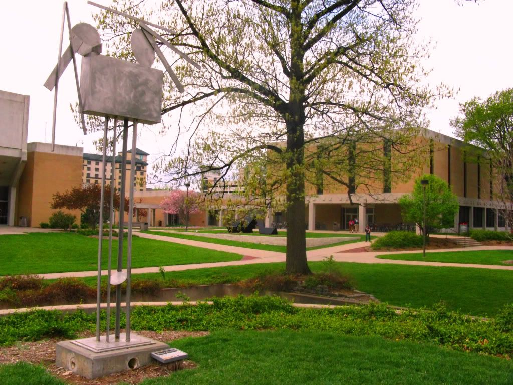
The context of the work is on the small, south-facing, raised jut, outside, in the sculpture garden surrounding the Sheldon, on the UNL campus, in Lincoln. Even the Sheldon is free but being an outside sculpture, the works audience includes every passing person who happens to glance in its direction, although the majority of such an audience will be paying it little attention let alone giving it any depth of analysis. Through the context of being in a sculpture garden its purpose is that of sculpture and not simply for decoration as some works fall to.

Tuesday, April 13, 2010

WP3: Prewrite 2

First, my object (Superstructure on 4) is an outdoor piece of artwork. Its completely metal materiallity allows it to weather the weather without weathering (really any kind of weather whether it be rough or not). This also means that it is viewed from outside. It is located on a peninsula of the higher ground reaching into the cement valley path that travels along the side of the museum. Looked at from below emphasizes its height even more (which is already somewhere around 10 ft. already). It can also be viewed from far away, not being wrapped by walls like most indoor works. The other close viewpoint, and the one I used in my primary analyses and for my perceptual drawing project, is on the peninsula (north of the object). Sitting especially emphasizes the impact, but this point of view will often put the sun behind the object, making it more difficult to see. This is where the placard is viewed from so this view is atleast partly intential and what I will be considering the "front" for orientation purposes.

Superstructure on 4 is all metal (stainless steel if remembered correctly-will check) with a brushed pattern on it, most visible on the main box shape given its largest plane but only visible either very close or from the reflection of light, primarily from the sun. This is an interesting additional level of information that can easily escape inital analysis depending on the viewpoint. It's also particularly interesting given the very geometric and constructed nature of the object and then finding this more free-handed brushing on the surfaces.

Being geometric in nature, the number of elements stays fairly low, only 17 elements counting everything including the base (although 17 may seem like a fairly high number and it indeed adds to the objects overall complexity, each elements is very simple in itself). A visual hierarchy is also formed. The object can be split into four primary groups: the legs, the main box, and the two collections of a circular form and 4 strips atop the main box. The top portion, the box and the elements atop it, is given additional emphasis because of its activity density. The legs are four very thin and straight (vertically, a couple have L shapes) with only the connecting oval very low to break its very straight and unchanging nature. This creates the contrast that draws the audience to the very top portion which makes around a third of the total height if generous bounds are given.

The object also has visual unity. First this is done by materiallity, everything having the same color, texture, etc. Secondly, the predominance of the metal strips and the repeated circular shapes (ovals and a many-sided regular polygon on close inspection) mean that the geometric nature also creates unity in the object.

WP3: Prewrite 1

A large majority of my experience with art has come from this past school year. Being more interested in math/sciences, I hadn't taken any art classes in high-school. This year however, as a student in the pre-architecture program, not only have a been taking an online course the purpose of which is to learn how to analyze art and design but I have been taking the visual literacy courses that have had me working with colors, speculative drawing, analysis/composition, and perceptual drawing.

This experience has given me the ability to clearly analyze art-objects like the ones we have seen earlier and mine right now (as far modern-art can be analyzed clearly). It has worked out that my archictecture courses work complementary with this English course, both teaching analysis techniques I can apply to the other. With a better ability to analyze art rhetorically and technically I have also found a larger appreciation in modern art than I had before (although I still think a painted red dot shouldn't sell for thousands of dollars).

Performing an analysis on modern art can certainly be tricky, especially while trying to find a starting point, but without understanding of its technical elements, it is either impossible or largely arbitrary. Just as with our analyses of documentary photographs, I will likely approach any analysis (even though I'll be doing the second option for WP3) through the means of analyzing the elements first and then coalescing them into larger arguments.

I made my initially decision on my piece (Superstructure on 4) of artwork for WP3 because I thought it would make an excellent subject of a project for my perceptual drawing class (and it did) (I'll post the pictures of it up once I get them back as my multimedia element). Also I have a pretty easy idea about how to model it as well. I look forward to working with it (a bit apprehensively) for this project.

Tuesday, April 6, 2010

WP2: Final Draft

Authors Note:

xkcd (proper capitalization) has been one of my favorite comics and I scanned through all 600 or so to find one to analyze, maybe not the funniest but the best to find an argument in. This comic Dreams worked great for that analysis with both its very simple graphical natures and its self-referencing breaks from the norms of comics.

Compared to Writing Project 1 where I found it initially difficult to find a unified argument, relying on the development of the technical elements to reveal it to me, finding the argument and supporting elements was relatively a simple task for this comic. The simple nature of the comic (as I discuss in my essay) creates additional emphasis on that that remains and the character (second figure) is fairly clearly forwarding an argument himself through the text that is his implied speech.

Subsequently I didn't change the direction I was taking with the main argument or any of the supporting ones although I did add in a couple small pieces to re-emphasize the connections to the thesis. First I added just a little to emphasize the self-referencing breaks from the norms. I also added a note of another break from the norm that I had not originally included that the simple stick figures are a far cry from the expected expertise of professional comics (which is really saying something). Overall I attribute not needing many changes to a lucky first draft and not needing/wanting to utterly change the direction of the essay.


Final Draft:


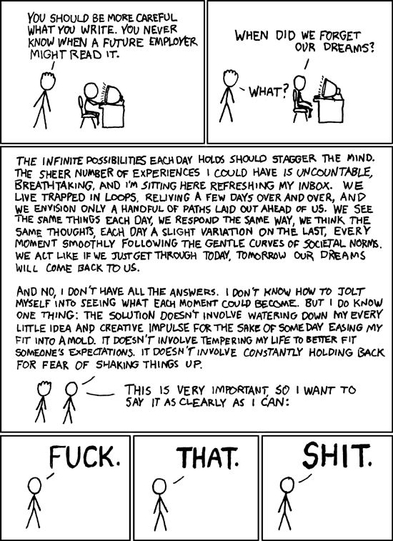
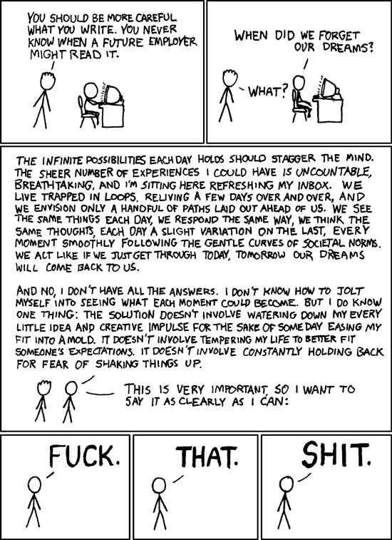
Society, by definition, develops an extensive set of norms, whether they are explicitly coded into law or remain informal. When the environment changes, so must the norms to match new conditions. Since the advent of the Internet and the even more recent rise of social networking websites, the norms of the new medium have continued to evolve. The particular case of employers finding inappropriate posts of employees brings this to light. Although many sites give false senses of anonymity or privacy, more content is openly available than people sometimes expect. This has lead to situations where people have gotten in trouble with current or future employers because of their online posts. It is situations like this one that have lead to the questioning of what is acceptable and what is not in the digital world. Although it is indeed these set of norms that allow society to function as it does, to what extent should these norms extend and how strictly should they be adhered to? The xkcd comic Dreams speaks to this question with the argument that although we will always live within society, people shouldn’t constantly water-down or hold back from fear of breaking the norms. This argument is supported by the break from the norms of comics and the small number of elements.

The first break from the norms of comics that Dreams makes lies in the paneling. If asked just to indicate a comic, one would likely draw three squares aligned in a row (like the Garfield minus Garfield comic strip below - a parody of the popular Garfield comic). This strip of panels (hence comic strip) is the most basic norm of comics, with additional panels being added, sometimes in a second row below the first. Looking at most Sunday newspapers, the comics will be found almost entirely in this format, with a few arranged vertically or some single panels. Although the comic Dreams still maintains the use of panels and aligned edges that identify it as a comic, it doesn’t follow the simple format so often seen. Still left to right, the comic has a vertical orientation. More importantly and noticeable is that the third and central panel dominates the comic; in fact the rest of the panels could fit into this one alone. This is contrasted by the last three panels that if were taken alone would at least follow the form of standard comic strips.

The second break is the use of text over art in this comic. The comic contains only the necessary graphically, but, especially in the large third panel, has an almost overwhelming amount of text. The difference is very noticeable from the standard of full panel art and little text accompanying. The large amount of text and its high density in the third panel is leaving the norms so far to as approach the format of an essay, line after line of text organized by paragraphs. This causes the third panel to become the focal point of the comic, juxtaposed by the final three panels which each contain a single, large, bolded word (following the conventions of comics to imply a loud/emphasized and segmented statement). The simple graphics and stick figures also break from the expected expertise or detail of "professional" cartoons; the artwork is something that just about anyone can do (and many could probably do better). Although the final three panels are closer to the norms of comics, their content continues to not follow them, especially given the context of comics’ preeminence in family-friendly forms like newspaper. These breaks from the norms of comic strips emphasize the comic’s self-referenced argument that we shouldn’t mold ourselves to the “curves of societal norms” by providing example in itself. Limiting comics to the standard of three panels necessarily undermines the “infinite possibilities” of the medium, following the restrictions of text to graphics balance resulting in the same effect. Dreams on the other hand intentionally does not fit into the mold of comics and looking at the last three panels, it doesn’t water itself down either.

There is also a very purposefully small number of elements in the comic. First, the only graphics included are those necessary to the story, two figures talking and a computer that the second is initially working at. Without even so much as a hint of background, we are left to focus on the figures remaining and the text of their “speech”. In fact, after the first two panels, when it is no longer necessary, the simple computer is removed. Similarly, the first figure, which is only differentiated by a slight difference in “hair” to distinguish speakers, is not included in the final three panels when he is no longer needed. This clearly emphasizes the remaining content that was included.

The simple nature of the graphics also makes the situation more relatable. By taking the abstraction of the figures to the extreme of stick figures, not even showing a face or gender, the comic allows the audience to fill in the details with whatever or whoever they want. The computer, desk, and chair are similarly kept at their most simple shapes. Because of the lack of background, we can’t even tell if the two figures are at work, school, home, or even anywhere with a computer. The resulting universality makes it an “everyone issue”, something everyone can relate to.

By breaking the norms of comic strips and emphasizing its universal content through simplicity, the comic Dreams forwards the argument that we shouldn’t “temper [our] lives to better fit into a mold”, to “hold back for fear of shaking things up.” People are always making decisions (often subconscious) of which norms to fit in and which to break; whether to “go with the flow” or introduce novelty. Especially as the environment of the Internet continues to grow and evolve, we will have to ask ourselves not only which norms to adhere to but what the norms of the new medium are to become.

Thursday, April 1, 2010

WP2: Second Draft


Society, by definition, develops an extensive set of norms, whether they are explicitly coded into law or remain informal. When the environment changes, so must the norms to match new conditions. Since the advent of the Internet and the even more recent rise of social networking websites, the norms of the new medium have continued to evolve. The particular case of employers finding inappropriate posts of employees brings this to light. Although many sites give false senses of anonymity or privacy, more content is openly available than people sometimes expect. This has lead to situations where people have gotten in trouble with current or future employers because of their online posts. It is situations like this one that have lead to the questioning of what is acceptable and what is not in the digital world. [Transition]. Although it is indeed these set of norms that allow society to function as it does, to what extent should these norms extend and how strictly should they be adhered to? The xkcd comic Dreams speaks to this question with the argument that although we will always live within society, people shouldn’t constantly water-down or hold back from fear of breaking the norms. This argument is supported by the break from the norms of comics and the small number of elements.

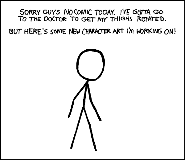
The first break from the norms of comics that Dreams makes lies in the paneling. If asked just to indicate a comic, one would likely draw three squares aligned in a row (like the Garfield minus Garfield comic strip below). This strip of panels (hence comic strip) is the most basic norm of comics, with additional panels being added, sometimes in a second row below the first. Looking at most Sunday newspapers, the comics will be found almost entirely in this format, with a few arranged vertically or some single panels. Although the comic Dreams still maintains the use of panels and aligned edges that identify it as a comic, it doesn’t follow the simple format so often seen. Still left to right, the comic has a vertical orientation. More importantly and noticeable is that the third and central panel dominates the comic; in fact the rest of the panels could fit into this one alone. This is contrasted by the last three panels that if were taken alone would at least follow the form of standard comic strips.

The second break is the use of text over art in this comic. The comic contains only the necessary graphically, but, especially in the large third panel, has an almost overwhelming amount of text. The difference is very noticeable from the standard of full panel art and little text accompanying. The large amount of text and its high density in the third panel is leaving the norms so far to as approach the format of an essay, line after line of text organized by paragraphs. This causes the third panel to become the focal point of the comic, juxtaposed by the final three panels which each contain a single, large, bolded word (following the conventions of comics to imply a loud/emphasized and segmented statement). Although the final three panels are closer to the norms of comics, their content continues to not follow them, especially given the context of comics’ preeminence in family-friendly forms like newspaper.
These breaks from the norms of comic strips emphasize the comic’s argument that we shouldn’t mold ourselves to the “curves of societal norms”. Limiting comics to the standard of three panels necessarily undermines the “infinite possibilities” of the medium, following the restrictions of text to graphics balance resulting in the same effect. Dreams on the other hand intentionally does not fit into the mold of comics and looking at the last three panels, it doesn’t water itself down either.

There is also a very purposefully small number of elements in the comic. First, the only graphics included are those necessary to the story, two figures talking and a computer that the second is initially working at. Without even so much as a hint of background, we are left to focus on the figures remaining and the text of their “speech”. In fact, after the first two panels, when it is no longer necessary, the simple computer is removed. Similarly, the first figure, which is only differentiated by a slight difference in “hair” to distinguish speakers, is not included in the final three panels when he is no longer needed. This clearly emphasizes the remaining content that was included.

The simple nature of the graphics also makes the situation more relatable. By taking the abstraction of the figures to the extreme of stick figures, not even showing a face or gender, the comic allows the audience to fill in the details with whatever or whoever they want. The computer, desk, and chair are similarly kept at their most simple shapes. Because of the lack of background, we can’t even tell if the two figures are at work, school, home, or even anywhere with a computer. The resulting universality makes it an “everyone issue”, something everyone can relate to.

By breaking the norms of comic strips and emphasizing its universal content through simplicity, the comic Dreams forwards the argument that we shouldn’t “temper [our] lives to better fit into a mold”, to “hold back for fear of shaking things up.” People are always making decisions (often subconscious) of which norms to fit in and which to break; whether to “go with the flow” on introduce novelty. Especially as the environment of the Internet continues to grow and evolve, we will have to ask ourselves not only which norms to adhere to but what the norms of the new medium are to become.

Tuesday, March 30, 2010

WP2: First Draft


Society, by definition, develops an extensive set of norms, whether they are explicitly coded into law or remain informal. When the environment changes, so must the norms to match new conditions. Since the advent of the Internet and the even more recent rise of social networking websites, the norms of the new medium have continued to evolve. The particular case of employers finding inappropriate posts of employees brings this to light. Although many sites give false senses of anonymity or privacy, more content is openly available than people sometimes expect. This has lead to situations where people have gotten in trouble with current or future employers because of their online posts. It is situations like this one that have lead to the questioning of what is acceptable and what is not in the digital world. [Transition]. Although it is indeed these set of norms that allow society to function as it does, to what extent should these norms extend and how strictly should they be adhered to? The xkcd comic Dreams speaks to this question with the argument that although we will always live within society, people shouldn’t constantly water-down or hold back from fear of breaking the norms. This argument is supported by the break from the norms of comics and the small number of elements.

The first break from the norms of comics that Dreams makes lies in the paneling. If asked just to indicate a comic, one would likely draw three squares aligned in a row. This strip of panels (hence comic strip) is the most basic norm of comics, with additional panels being added, sometimes in a second row below the first. Looking at most Sunday newspapers, the comics will be found almost entirely in this format, with a few arranged vertically or some single panels. Although the comic Dreams still maintains the use of panels and aligned edges that identify it as a comic, it doesn’t follow the simple format so often seen. Still left to right, the comic has a vertical orientation. More importantly and noticeable is that the third and central panel dominates the comic; in fact the rest of the panels could fit into this one alone. This is contrasted by the last three panels that if were taken alone would at least follow the form of standard comic strips.

The second break is the use of text over art in this comic. The comic contains only the necessary graphically, but, especially in the large third panel, has an almost overwhelming amount of text. The difference is very noticeable from the standard of full panel art and little text accompanying. The large amount of text and its high density in the third panel is leaving the norms so far to as approach the format of an essay, line after line of text organized by paragraphs. This causes the third panel to become the focal point of the comic, juxtaposed by the final three panels which each contain a single, large, bolded word (following the conventions of comics to imply a loud/emphasized and segmented statement). Although the final three panels are closer to the norms of comics, their content continues to not follow them, especially given the context of comics’ preeminence in family-friendly forms like newspaper.
These breaks from the norms of comic strips emphasize the comic’s argument that we shouldn’t mold ourselves to the “curves of societal norms”. Limiting comics to the standard of three panels necessarily undermines the “infinite possibilities” of the medium, following the restrictions of text to graphics balance resulting in the same effect. Dreams on the other hand intentionally does not fit into the mold of comics and looking at the last three panels, it doesn’t water itself down either.

There is also a very purposefully small number of elements in the comic. First, the only graphics included are those necessary to the story, two figures talking and a computer that the second is initially working at. Without even so much as a hint of background, we are left to focus on the figures remaining and the text of their “speech”. In fact, after the first two panels, when it is no longer necessary, the simple computer is removed. Similarly, the first figure, which is only differentiated by a slight difference in “hair” to distinguish speakers, is not included in the final three panels when he is no longer needed. This clearly emphasizes the remaining content that was included.

The simple nature of the graphics also makes the situation more relatable. By taking the abstraction of the figures to the extreme of stick figures, not even showing a face or gender, the comic allows the audience to fill in the details with whatever or whoever they want. The computer, desk, and chair are similarly kept at their most simple shapes. Because of the lack of background, we can’t even tell if the two figures are at work, school, home, or even anywhere with a computer. The resulting universality makes it an “everyone issue”, something everyone can relate to.

By breaking the norms of comic strips and emphasizing its universal content through simplicity, the comic Dreams forwards the argument that we shouldn’t “temper [our] lives to better fit into a mold”, to “hold back for fear of shaking things up.” People are always making decisions (often subconscious) of which norms to fit in and which to break; whether to “go with the flow” on introduce novelty. Especially as the environment of the Internet continues to grow and evolve, we will have to ask ourselves not only which norms to adhere to but what the norms of the new medium are to become.

Monday, March 29, 2010

Statement of Purpose

My meta-purpose of writing this essay is to earn a good grade for my class and learn in its process. The main purpose within the writing the essay is to find and then present a main argument forwarded by the xkcd comic Dreams. I'll explain how the technical elements and content within forward this argument. After settling with a final and primary argument to analyze within the comic I will seek to explain how the technical elements and the content of the comic combine to develop an ethos, pathos, and logos that support the main argument.

My primary audience is my teacher for this class, the one who assigned it and will eventually be analyzing my analysis and grading its presentation. It is for this audience that this text (Writing Project 1) is being created and considering which it will be sculpted. Specifically, first, I will be following the guidelines for analysis that we have discussed thus far in class and established by the texts that our class was provided with (Compose, Design, Advocate: a rhetoric for integrating written, visual, and oral communication, particularly from Chapter 15: Analyzing Comics, and the section from Scott McCloud's book The Vocabulary of Comcis). Secondly for this audience, the technical wording from that text will be invoked in the explanations of the comic with its elements and the arguments that they forward.

There are also secondary audiences that may find, and with the will to, read my project, the first group being my classmates. This includes not only those in my class currently (who will be looking more likely out of interest although possibly an after-the-fact peer review) but also those future students who may be taking this class (most likely with the same teacher) who may look back at my project as an example (hopefully not for things not to do), just as we have looked back at the project of a former student already.

The rest of the possible secondary audiences include nearly everyone that can read English and has Internet access. In this era of expansive and yet growing connectivity of all things information, the Internet has created a network facilitating authors, photographers, creators, etc, to reach nearly endless audiences. Posted on blogger, my project will be completely open to access, meaning that, given the will to find it (possibly searching for information of the photographer or photograph specifically or the photograph's subject) or the coincidence of wondering upon it, the project will be fully visible to see. For this audience, although using the technical wording provided in our book, I will attempt to keep everything understandable for outsiders who may not know the language set up or may use a different wording of their own.


The main context of my Writing Project 1 will be as a blog post on this blog (given the links and hierarchy of the class' blog) and will thus be viewed from the Internet digitally, (although because of its open access and the adaptability of digital text it may be easily be moved or even transcribed to non-digital contexts; i.e. printed off for review). The main impact of this context is that it means that the audiences will also have access to the rest of the information available through the Internet, some of which I will be utilizing directly in my project through the use of multimedia elements and hyperlinks, just as I have been in this statement of purpose.

WP2: Pre-write 2

The main back story for this comic comes from the fairly recent stories of people getting in trouble, particularly with their employers, because of things they have posted online (often social networking sites), whether text or photographs. People that had posted either rude or threatening things online or inappropriate pictures of themselves have been caught by employers or otherwise and were punished. A lot of this comes from the fact that the Internet and social networking websites are still evolving, especially in terms of rights and privacy. What social networking sites and other websites most often do is create a false sense of anonymity or privacy. This has lead to either peoples current or future employers, etc, to find said posts and invoke repercussions. This leads to the first figure in the comic telling the second to be careful about what he posts online.

Another set of contexts of note is the norms of modern comic strips. The most general stereotype is the three aligned square panels in a strip, with more being added, particularly a second row for many longer comics, or some panels being widened. This said, the comic at hand doesn't neatly fit such a form, although the outer boundaries are still aligned. The comic has a much more vertical flow with a large blank panel in the center. The last three frames taken by themselves would constitute a more normally expected comic strip.

Secondly, the difference between comics and pure text being the drawings (or less so pictures), this comic also breaks the norms of art to text balance. Most comics have full panel art and little text. This comic breaks from that pattern by first limiting the drawn to the very minimum of telling the story at hand while, especially in the third panel as it becomes the focus, it contains much more text than would be expected in a comic, very condensed. The art of the comic is limited to the stick figures and the basic desk/computer that the second is initially sitting at, a slight difference in the "hair" used to indicate who is speaking in the latter frames. After the first two frames, when the computer is no longer necessary to the story, it is removed, giving additional focus to whats left, the simple figure and especially the text that he is "saying" (the first person is even removed after the first two frames when he no longer has anything to say). The last three panels again return to more of the norm, containing little text, although the content still breaks the expected of comics.

Thursday, March 11, 2010

WP2: Pre-write 1


This first thing of note when comparing this comic to others (and in fact the majority of the other xkcd comics) is that it has a very simplified form. All people as simple stick figures without even the dot dot line face seen in many. Despite this, the movement between panels and the curved positions imply a stronger connection from which we can still derive feeling, etc. This, coupled with the handwriting type, gives a simple ethos, relating it as something of a quality the audience could make themselves, especially those with no artistic talent, the quality coming not from technical implementation but instead the story or dialogue occurring, again, something the audience could do themselves given the time or spark of comedic insight.


The backgrounds a similarly sparse (many times not existing), only shown when necessary to the story being told (here's an example of where a simplified background is used to tell the story but is still de-emphasized). This inclusion or exclusion strongly shows the management of the number of elements in each frame. Apart from simply not including them when not necessary to save time/work, it strongly emphasizes the elements that are left, leaving the audience no choice but to focus on them. Whenever the background or props are included in a strip it is because of their importance in the story. The only sort of background in this comic is the chair, desk, and computer that the man is sitting at, used to show, when taken with the other man's statement, that he is posting something online that somebody might find objectionable in the future (not even a floor or any other sort of environment is included). And after the the computer is no longer necessary (once the speech has started) it is no longer included, no longer needing to serve a purpose.


Another trait of many xkcd comics, this being a prime example, is the emphasis on the dialogue taking place, wherein the majority of the comedy occurs. This comic contains significantly more dialogue than most xkcd comics, to the point of emphasizing a long drawn out (and well spoken) speech. The length and coherence of this speech provides much of the comedic value created by the contrast of the unexpected final three panels. By the end, the audience is expecting a continuation of the ethos established by the long speech, finishing in a sophisticated and intelligent, even if simple, conclusion. The disparity created by the simplistic, swearing, approaching slang finale is what creates much of the humor. By doing the unexpected the audience is amused and finds novelty in the story.


Furthermore, the way the panels are split up continues to show the emphases of the comic strip, the middle panel containing the entirety of the long speech, emphasizing that its one speech and especially its length when given the context of average comic dialogues. The final three frames each contain one word in large bold type with a period, emphasizing what he is saying and that it is i.e. louder with pronounced pauses between the words.

Sunday, March 7, 2010

WP1: Final Draft

Author’s Note:

When first approaching the analysis of this photograph, I didn’t have any kind of specific argument or even direction for an argument that I was thinking of taking (which is most likely the correct way to approach such analysis). This said I started with the uses of technical elements, for instance the ones I ended up using were framing, cropping, and coloration, looking for arguments that they made. However, it was still a process searching for those sub-arguments, lacking an overall direction to tie them into.

To start off, I played it safe by staying as general as I could with my thesis (stating the argument I was analyzing). My first thesis even stayed away from making even any direct argument, noting the industrial decay (my first jumping board) and the pathos developed by the elements I was discussing, “Taken in November of 1938, John Vachon’s photograph American Smelting and Refining Company: largest iron smelter in the world illustrates the industrial decay of the Great Depression and develops a tired, run-down pathos through the technical elements of framing, cropping, and coloration.” In my second draft, this evolved to a vague connection relating the pathos developed to a comparison with the attitude of the American people at the time of its taking. The thesis I ended with in my final draft was much more specific on the connections within the essay. The contextual development was also a source of change in my drafts. Although the general information remained generally the same, the organization and connotations used evolved several times. Specifically, a couple of my original wordings carried connotations of improving conditions instead of emphasizing the setbacks.

Similarly, the general ideas of the body paragraphs remained largely the same. However, several of them required wording changes or additions to emphasize their connections or impacts to the over-arching argument. By further relating the connections to the development of the thesis, it strengthened each respective sections support. Another specific expansion occurred at the end of the paragraph about the impact of the coloration. In addition to the pathos developed by the dominant grays of the image, I added a note that the fact that it’s a black and white photograph reminds the audience (especially contemporary audience) that it is a historical photo.

The biggest change from the first two drafts to the final was the explicit explanation outlining how the pathos developed by the different elements symbolized the attitude of the time. Incorporated into the conclusion because of its contextual information and final development of my thesis, it again explains the general attitude of the Great Depression and how the pathos illustrated that attitude. This not only provided corroborated my claim of the mirroring but provided a conclusion that showed the developments from the body of the essay, not merely a restatement of the introduction.

Another noted change is that I had not originally included the multimedia elements or relevant hyperlinks in my rough drafts (or citations in my first). This was not an oversight as much as, still unsure of the directions I was going to be taking (not even having a concise thesis yet), I felt that including those elements among content that was apt to change wasn’t going to be particularly useful (the main thing to discuss with any multimedia elements is there relevance to the essay and the local information of where they are in the essay, something fairly simple as long as it’s account for, and the focus of the revisions was on the content and organization of the written text). So while keeping ideas and possibilities noted, those elements were not physically included in the drafts.


Final Draft:

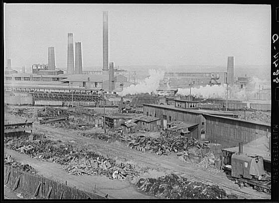
By 1938, the Great Depression had been going strong for almost a decade and although some improvements had been made, the second recession in 1937 had set back most of the progress made. After the second recession, unemployment had risen again to 19% and industrial production had fallen 25%. Economic recovery was slow and significant improvements were still required for a return to normalcy. In fact, it would take the United States’ sudden involvement in World War II to finally break its economic slump (Smiley). Taken in November of 1938, still before the recovery from the second recession, John Vachon’s photograph American Smelting and Refining Company: largest iron smelter in the world uses the industrial decay of the Great Depression to develop the rundown pathos of the poorly maintained environment, symbolically mirroring the general attitude of the American people from the time of its taking, through the technical elements of framing and cropping and coloration.

The framing of the photograph American Smelting and Refining Company: largest iron smelter in the world naturally creates hierarchy in its elements. The first area the eye is drawn to upon looking at the photograph is the foreground, which consists of the scrap yard and adjacent buildings. Being the closest and thus easiest to see, this gives the scrap yard an emphasis over the rest of the factory’s grounds. Furthermore, the height of the shot, possibly taken from atop a nearby building, looks into the yard and shows the factory behind but isn’t high enough to give a clear shot of the latter. This gives additional emphasis to the yard, its view being unobstructed unlike those further back. Given its prominence in the photograph’s hierarchy we take the yard and its contents to be more important than the other things in the image. Examining the yard shows that it is filled with what appears to be scrap (old metal to be re-smelted and recycled) although the piles could include trash of other sorts as well. Given the large drop in industrial production during the Great Depression, still continuing to the taking of this picture, it’s a reasonable conclusion that this scrap wasn’t being used simply because of low demand. Also given the cultural context and associations of sitting scrap metal with poorer areas (i.e. in the poor part of town or in enervated rural regions), it speaks to the general condition of the Great Depression whilst also carrying with it the pathos of the audience’s experiences (or lack thereof) with such areas. Specifically, by generating the sense of economic dilapidation and decay, the photograph develops a feeling of a lack of progress, opportunities, and even to an extent, hope.

The surrounding buildings, and indeed the rest of the yard itself, continue the dirty, worn down appearance of the scrap. The buildings, likely meant for storage instead of work, seem even broken in parts but certainly unclean and not of expensive make. This setting strengthens and reaffirms the aforementioned impact of the scrap located within. It is only in the background that the cleaner factory, and its many smoke stacks, can be seen, carrying its connotations of technology, production, and modernism. Analogously, the Great Depression gave emphasis (especially in a historical context) to the decline in production, unemployment, and economic stagnation that came with and after the initial recession, placing it in front of any continuing activity and production.

Another consideration derived from the framing and cropping of the photograph is the noted lack of any people, even any plants. First, this gives further emphasis to the other subjects of the photo, reducing the number of elements hence making it easier to distinguish the intended focus(es). By not having people included in the image, it clears the image of further clutter and takes them away as possible targets of discussion (despite the fact that their lack has sparked this note). Secondly the lack of people, and more specifically people working, further illustrates the impact that the Great Depression has had on industrial production; it certainly wouldn’t have served this argument’s purposes to show a yard crowded with men at work. The removal of the organic also serves to continue not only the industrial motif but the rundown pathos developed by the image, removing empathy and increasing the sense of desolation.

The cropping plays a role in its own right as well. Being a single photograph of this subject, the issue of cropping comes down to the question of what lies beyond the edges of the photograph and why were things included or not. First, the edges of the yard are cut off by the edges of the photograph. This denotes a lesser importance or emphasis on those things not included completely in the picture, in this case focusing on the center of the yard instead of the buildings the run off the edge, including both those in the foreground and the factory in the background. Secondly, the cropping does not include many of the boundaries of the factory grounds, only a small portion of the fence visible at the bottom of the picture. This lets the audience extrapolate the content of the image beyond its physical edges. In this picture, cropping lets us imagine the scrap yard expanding beyond those boundaries, likely surrounded then by additional industrial areas and buildings not of the American Smelting and Refining Company proper. This continuation strengthens the photograph’s argument as one that is much more universal than a particular instance, that it is a general situation instead of specific condition.

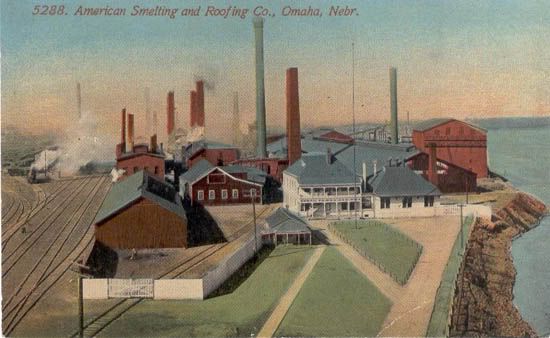
The coloration also plays a role in the development of the photograph’s arguments, or as should be said, the lack of coloration. Being a black and white photograph, it only contains the achromatic spectrum. The colors of an image contribute to the pathos therein, drawing on what the audience has learned to associate with them. This photograph is primarily made up of grays, only including small spots of strict white or black. The grayness again continues the industrial motif, mirroring the impact that the exclusion of anything organic has. This is emphasized further by the fading (likely just from the camera or developing of the photograph) and the visible, white smoke which create a sense of haze and less than clean air quality, tying again into the audience’s associations with industry. Secondly, the colors create a tired, dreary, or even gloomy pathos that ties into the aforementioned rundown pathos. By lacking any vibrant hues or even stark contrast, the coloration makes the picture seem emotionless (unlike this colored illustration of the factory). The black and white nature of the photograph also, especially for contemporary audiences, clearly reminds viewers of its historic context. To an extent, this decreases the audience’s (again, especially contemporary and younger audiences) ability to relate with the photograph, although the current recession makes such relations more apt to happen.

Knowing the context of the photograph, these combined technical elements serve as logos to the symbolic comparison of the nation’s general attitude of the time. After almost a decade of the Great Depression and shortly after a second recession, America’s economic prospects, and thus the American people’s prospect, did not lean towards the hopeful. With so many unemployed and more who lost their savings, the Great Depression didn’t breed optimism. The lack of opportunities and progress, in fact facing regression, the national outlook for life and the times to come was not good. The photograph works to mirror this state of mind by developing a similar pathos. By focusing on the dilapidation of the scrap yard and extrapolating it beyond the photograph’s edges, it emphasizes the time’s economic conditions. This coupled with the removal of the organic and the dominating use grays serves to portray the aforementioned outlook even further. Through this pathos, developed by the technical elements of framing and cropping and coloration, the John Vachon’s photograph American Smelting and Refining Company: largest iron smelter in the world illustrates and reminds its audience of this attitude.

Broad, Mark. "I remember the Wall Street Crash." BBC News. BBC News, 6 Oct. 2008. Web. 17 Feb. 2010. (Site)

Smiley, Gene. "Great Depression." Library of Economics and Liberty. Library of Economics and Liberty, n.d. Web. 17 Feb. 2010 (Site)

Thursday, March 4, 2010

WP1: Rough Draft 2


By 1938, the Great Depression had been going strong for almost a decade and although some improvements had been made, the second recession in 1937 had set back most of the progress made. After the second recession, unemployment had risen again to 19% and industrial production had fallen 25%. Economic recovery was slow and significant improvements were still required for a return to normalcy. In fact, it would take the United States’ sudden involvement in World War II to finally break its economic slump. Taken in November of 1938, John Vachon’s photograph American Smelting and Refining Company: largest iron smelter in the world uses the industrial decay of the Great Depression to develop a tired, run-down pathos, mirroring the general attitude of the American people from the time of its taking, through the technical elements of framing, cropping, and coloration.

The framing of the photograph American Smelting and Refining Company: largest iron smelter in the world naturally creates hierarchy in its elements. The first area the eye is drawn to upon looking at the photograph is the foreground, which consists of the scrap yard and adjacent buildings. Being the closest and thus easiest to see, this gives the scrap yard an emphasis over the rest of the factory’s grounds. Furthermore, the height of the shot, possibly taken from atop a nearby building, looks into the yard and shows the factory behind but isn’t high enough to give a clear shot of the latter. This gives additional emphasis to the yard, its view being unobstructed unlike those further back. Given its prominence in the photograph’s hierarchy we take the yard and its contents to be more important than the other things in the image. Examining the yard shows that it is filled with what appears to be scrap (old metal to be re-smelted and recycled) although the piles could include trash of other sorts as well. Given the large drop in industrial production during the Great Depression, still continuing to the taking of this picture, it’s a reasonable conclusion that this scrap wasn’t being used simply because of low demand (in the least not being used quickly, still left to sit and rust for extended periods). Also given the cultural context and associations of sitting scrap metal with poorer areas (i.e. in the poor part of town or in enervated rural regions), it speaks to the general condition of the Great Depression whilst also carrying with it the pathos of the audience’s experiences (or lack thereof) with such areas. Specifically, it works to establish the sense of economic rundown, or even decay, and the similarly situated attitude of the people in the Great Depression.

The surrounding buildings, and indeed the rest of the yard itself, mirror this dirty, worn down appearance. The buildings, likely meant for storage instead of work, seem even broken in parts but certainly unclean and not of expensive make. This setting strengthens and reaffirms the aforementioned impact of the scrap located within. It is only in the background that the cleaner factory, and its many smoke stacks, can be seen, carrying its connotations of technology, production, and modernism. Similarly, the Great Depression gave emphasis (especially in a historical context) to the decline in production, unemployment, and economic stagnation that came with and after the initial recession, placing it in front of the continuing activity and production.

Another consideration derived from the framing of the photograph is the noted lack of any people, even any plants. First, this gives further emphasis to the other subjects of the photo, reducing the number of elements hence making it easier to distinguish the intended focus(es). By not having people included in the image, it clears the image of further clutter and takes them away as possible targets of discussion (despite the fact that their lack has sparked this note). The removal of the organic also serves to continue not only the industrial motif but the rundown pathos developed by the image.

Similar to the issue of framing is the cropping of the photograph. Being a single photograph of this subject, the issue of cropping comes down to the question of what lies beyond the edges of the photograph. First, the edges of the yard are cut off by the edges of the photograph. This denotes a lesser importance or emphasis on those things not included completely in the picture, in this case focusing on the center of the yard instead of the buildings the run off the edge, including both those in the foreground and the factory in the background. Secondly, the cropping does not include many of the boundaries of the factory grounds, only a small portion of the fence visible at the bottom of the picture. This lets the audience extrapolate the content of the image beyond its physical edges. In this picture, cropping lets us imagine the scrap yard expanding beyond those boundaries, likely surrounded then by additional industrial areas and buildings not of the American Smelting and Refining Company proper. This continuation strengthens the photograph’s argument as one that is much more universal than a particular instance, that it is a general situation instead of specific condition.

The coloration also plays a role in the development of the photograph’s arguments, or as should be said, the lack of coloration. Being a black and white photograph, it only contains the achromatic spectrum. The colors of an image contribute to the pathos therein, drawing on what the audience has learned to associate with them. This photograph is primarily made up of grays, only including small spots of strict white or black. The grayness again continues the industrial motif, mirroring the impact that the exclusion of anything organic has. This is emphasized further by the fading (likely just from the camera or developing of the photograph) and the visible, white smoke which create a sense of haze and less than clean air quality, tying again into the audience’s associations with industry. Secondly, it creates a tired, dreary, or even gloomy pathos that ties into the aforementioned rundown pathos. By lacking any vibrant hues or even stark contrast, the coloration makes the picture seem emotionless.

Through the technical elements of framing, cropping and coloration, John Vachon’s American Smelting and Refining Company: largest iron smelter in the world develops a dreary and rundown pathos, illustrating the similarly situated attitude of the American people at the time of its taking in November 1938. The Great Depression had seen massive drops in national wealth, employment, and production (industrial production especially). After just over nine full years of acute economic depression and a secondary recession, times were not looking good and it would have been hard to see the optimism of the slow economic recovery.

Broad, Mark. "I remember the Wall Street Crash." BBC News. BBC News, 6 Oct. 2008. Web. 17 Feb. 2010.

Smiley, Gene. "Great Depression." Library of Economics and Liberty. Library of Economics and Liberty, n.d. Web. 17 Feb. 2010

Tuesday, March 2, 2010

WP1: Rough Draft 1


By 1938, the Great Depression had been going strong for almost a decade and although some progress along the path to economic recovery had been made, the second recession in 1937 had set back most of the improvements.
Unemployment had risen again to 19%, although still below the high of 25% reached in 1932, and industrial production had fallen 25%. By the end of 1938, economic growth was once again slowly returning the nation to normalcy, even if it may not have felt like it to the American people. Taken in November of 1938, John Vachon’s photograph American Smelting and Refining Company: largest iron smelter in the world illustrates the industrial decay of the Great Depression and develops a tired, run-down pathos through the technical elements of framing, cropping, and coloration.

The framing of the photograph American Smelting and Refining Company: largest iron smelter in the world naturally creates hierarchy in its elements. The first area the eye is drawn to upon looking at the photograph is the foreground, which consists of the scrap yard and adjacent buildings. Being the closest and thus easiest to see, this gives the scrap yard an emphasis over the rest of the factory’s grounds. Furthermore, the height of the shot, possibly taken from atop a nearby building, looks into the yard and shows the factory behind but isn’t high enough to give a clear shot of the latter. This gives additional emphasis to the yard, its view being unobstructed unlike those further back. Given its prominence in the photograph’s hierarchy we take the yard and its contents to be more important than the other things in the image. Examining the yard shows that it is filled with what appears to be scrap (old metal to be re-smelted and recycled) although the piles could include trash of other sorts as well. Given the large drop in industrial production during the Great Depression, still continuing to the taking of this picture, it’s a reasonable conclusion that this scrap wasn’t being used simply because of low demand (in the least not being used quickly, still left to sit and rust for extended periods). Also given the cultural context and associations of sitting scrap metal with poorer areas (i.e. in the poor part of town or in enervated rural regions), it speaks to the general condition of the Great Depression whilst also carrying with it the pathos of the audience’s experiences (or lack thereof) with such areas. Specifically, it works to establish the sense of economic rundown, or even decay, and the similarly situated attitude of the people in the Great Depression.

The surrounding buildings, and indeed the rest of the yard itself, mirror this dirty, worn down appearance. The buildings, likely meant for storage instead of work, seem even broken in parts but certainly unclean and not of expensive make. This setting strengthens and reaffirms the aforementioned impact of the scrap located within. It is only in the background that the cleaner factory, and its many smoke stacks, can be seen, carrying its connotations of technology, production, and modernism. Similarly, the Great Depression gave emphasis (especially in a historical context) to the decline in production, unemployment, and economic stagnation that came with and after the initial recession, placing it in front of the continuing activity and production.

Another consideration derived from the framing of the photograph is the noted lack of any people, even any plants. First, this gives further emphasis to the other subjects of the photo, reducing the number of elements hence making it easier to distinguish the intended focus(es). By not having people included in the image, it clears the image of further clutter and takes them away as possible targets of discussion (despite the fact that their lack has sparked this note). The removal of the organic also serves to continue not only the industrial motif but the rundown pathos developed by the image.

Similar to the issue of framing is the cropping of the photograph. Being a single photograph of this subject, the issue of cropping comes down to the question of what lies beyond the edges of the photograph. First, the edges of the yard are cut off by the edges of the photograph. This denotes a lesser importance or emphasis on those things not included completely in the picture, in this case focusing on the center of the yard instead of the buildings the run off the edge, including both those in the foreground and the factory in the background. Secondly, the cropping does not include many of the boundaries of the factory grounds, only a small portion of the fence visible at the bottom of the picture. This lets the audience extrapolate the content of the image beyond its physical edges. In this picture, cropping lets us imagine the scrap yard expanding beyond those boundaries, likely surrounded then by additional industrial areas and buildings not of the American Smelting and Refining Company proper. This continuation strengthens the photograph’s argument as one that is much more universal than a particular instance, that it is a general situation instead of specific condition.

The coloration also plays a role in the development of the photograph’s arguments, or as should be said, the lack of coloration. Being a black and white photograph, it only contains the achromatic spectrum. The colors of an image contribute to the pathos therein, drawing on what the audience has learned to associate with them. This photograph is primarily made up of grays, only including small spots of strict white or black. The grayness again continues the industrial motif, mirroring the impact that the exclusion of anything organic has. This is emphasized further by the fading (likely just from the camera or developing of the photograph) and the visible, white smoke which create a sense of haze and less than clean air quality, tying again into the audience’s associations with industry. Secondly, it creates a tired, dreary, or even gloomy pathos that ties into the aforementioned rundown pathos. By lacking any vibrant hues or even stark contrast, the coloration makes the picture seem emotionless.

Through technical elements like framing, cropping and coloration, John Vachon’s American Smelting and Refining Company: largest iron smelter in the world develops a dreary and rundown pathos, illustrating the similarly situated attitude of the American people at the time of its taking in November 1938. The Great Depression had seen massive drops in national wealth, employment, and production (industrial production especially). After just over nine full years of acute economic depression and a secondary recession, times were not looking good and it would have been hard to see the optimism of the slow economic recovery.

Wednesday, February 24, 2010

WP1: Statement of Purpose

My main purpose in this first writing project is to find and then present a main argument forwarded by the photograph American Smelting and Refining Company, largest iron smelter in the world, explaining how its technical elements develop pathos, logos, and possibly ethos, when tied to the cultural context, support this argument (my "Main" purpose is to get a good grade with a secondary purpose of learning, the means of both being the statement above). I want to find an argument that is strongly supported in the photograph, deriving it from an technical analysis of its many elements. Once I have the final argument which I'm going to pursue, I'll seek to explain how those technical elements of the photograph forward that argument through their respective developments of pathos and logos, and less likely ethos (which doesn't involve much more in a photograph than keeping in focus).

My primary audience is my teacher for this class, the one who assigned it and will eventually be analyzing my analysis and grading its presentation. It is for this audience that this text (Writing Project 1) is being created and considering which it will be sculpted. Specifically, first, I will be following the guidelines for analysis that we have discussed thus far in class and established by the text that our class was provided with (Compose, Design, Advocate: a rhetoric for integrating written, visual, and oral communication). Secondly for this audience, the technical wording from that text will be invoked in the explanations of the photograph with its elements and the arguments that they forward.

There are also secondary audiences that may find, and with the will to, read my project, the first group being my classmates. This includes not only those in my class currently (who will be looking more likely out of interest although possibly an after-the-fact peer review) but also those future students who may be taking this class (most likely with the same teacher) who may look back at my project as an example (hopefully not for things not to do), just as we have looked back at the project of a former student already.

The rest of the possible secondary audiences include nearly everyone that can read English and has Internet access. In this era of expansive and yet growing connectivity of all things information, the Internet has created a network facilitating authors, photographers, creators, etc, to reach nearly endless audiences. Posted on blogger, my project will be completely open to access meaning given the will to find it (possibly searching for information of the photographer or photograph specifically or the photograph's subject) or the coincidence of wondering upon it, the project will be fully visible to see. For this audience, although using the technical wording provided in our book, I will attempt to keep everything understandable for outsiders who may not know the language set up or may use a different wording of their own.

The main context of my Writing Project 1 will be as a blog post on this blog (given the links and hierarchy of the class' blog) and will thus be viewed from the Internet digitally, (although because of its open access and the adaptability of digital text it may be easily be moved or even transcribed to non-digital contexts; i.e. printed off for review). The main impact of this context is that it means that the audiences will also have access to the rest of the information available through the Internet, some of which I will be utilizing directly in my project through the use of multimedia elements and hyperlinks, just as I have been in this statement of purpose.

Thursday, February 18, 2010

WP1: Pre-Writing Assignment 3

Starting towards the end of 1929, the Great Depression would strike and hard and fast. Within two weeks, $30 billion was lost from the U.S. economy. What started as a small drop quickly grew as panic spread, exasperating the problem and turning it into a cyclical downturn. The economic contraction continued until 1933, by which point the GNP had dropped 30.5% and consumer prices fell 24.4%. During this same time, industrial production fell 45%, house-building fell 80%, and more than 5000 banks had gone out of business. By the end of the contraction, 13,000,000 people were out of work, equated to unemployment rates of 25% of all workers and 37% of all non-farm workers. Businesses began to hang "No men wanted" to ward off the those looking for jobs and most of the people that were still employed still felt the fiscal tightening, either in reduction of pay or forced, uncompensated leave. The financial stresses of the contraction alone impacted many, leading to the anecdotal examples of the period's simultaneous downturn in mood, even causing some to take their own lives.

After the end of the primary contraction in 1933, the United States was still on a long road to recovery. Although actions were taken, like the creation of the WPA (the Works Progress Administration)and progress was made, the impacts of the depression continued to linger. Dropped again in 1937 by another decline, the U.S. wouldn't truly escape the Great Depression until the onset of the United States' involvement in World War II, starting in the early 1940's. With the revitalized industrial production and the job openings created by soldiers leaving for war, the economic recovery was underway, unemployment even dipping below 2% in 1943.

The picture American Smelting and Refining Company, largest iron smelter in the world was taken in November, 1938, still in the throws of the Great Depression. This given with the aforementioned statistic that industrial production had fallen by 45% (although by 1938 the United States was starting to see the signs of recovery, times were still bad since the additional recession in 1937) means that the American Smelting and Refining Company was very likely not doing very well, experiencing a large drop in production, leading to a drop in revenue, and finally leading to either a drop in wages or hours of work or outright layoffs as was the case with many industries.

The knowledge of this context deepens the impact of first, not seeing any people (workers) in the image (although the smoke stacks in the background are still churning giving indication of work being done, the lack of people creates the sense that the factory is more of an automaton than a place of work), and, second, the piles of scrap just sitting in the yard (likely not being used simply because the demand for product wasn't big enough). Also, at 1938, approaching nearly a decade of severe national economic depression, focusing on the scrap yard side, with not only its scrap/waste in the yard but the more run-down buildings, reflects the tired and run-down sense of the era.


Broad, Mark. "I remember the Wall Street Crash." BBC News. BBC News, 6 Oct. 2008. Web. 17 Feb. 2010. (Site)

Smiley, Gene. "Great Depression." Library of Economics and Liberty. Library of Economics and Liberty, n.d. Web. 17 Feb. 2010 (Site)